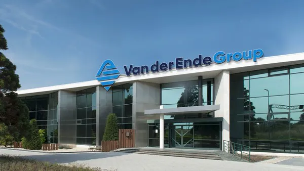
Van der Ende Group is introducing a new logo. The story behind this change exemplifies this family company. Great respect for the past, living in the ‘now,’ and always looking ahead to the future.
“The original idea was born many years ago. Back then, I thought: when I take over the baton from my father, I’m going to change the logo as a tribute to him,” says Lex van der Ende, Managing Director of Van der Ende Group.

And so, history would be repeating itself. Because the present Van der Ende Group logo, the distinctive AE, consists of the initials of Arie van der Ende. Arie was the father of Piet van der Ende, the founder of the Van der Ende Group. Out of respect for his father, Piet decided to incorporate his father’s initials in the logo. Lex: “From today, we have a logo that actually includes everything. Modern, international, and my father. We unveiled the new logo last Friday, at our annual company Christmas party, in the presence of all our colleagues. To be honest, I was quite nervous, but in the end, I was happy and proud that we could give this posthumous tribute to my father. I know that at first, he wouldn’t have been sure about the idea, but after a while, he would have been really pleased about it.”
Although this is the main reason for changing the logo, Van der Ende Group has another three important reasons. First, logos are dynamic: they change over the years, and this is also true for the Van der Ende Group logo. Second, the completely new house style will be further rolled out together with the logo. And the final reason is the company’s international strategy: hence the English word “Group” instead of the Dutch word “Groep.” This new logo is fresh and modern, and also looks good from an international point of view.
For more information:
Van der Ende Groep
[email protected]
